Yotsuya Campus Accessibility Map has been updated
- Sophia School Corporation
- Student Staffs
With the goal of ensuring that all users can move around campus safely and without hesitation, the Office of Sophia Sustainability Promotion is working to improve information barriers by upgrading universal design of signs at the Yotsuya Campus.
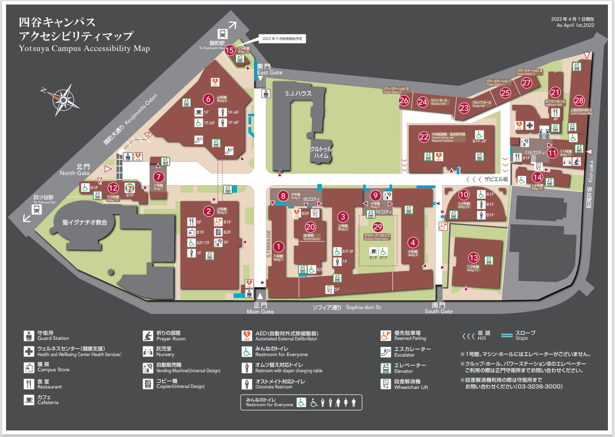
As part of these efforts, we have recently updated the Accessibility Map.
Based on the results of fieldwork surveys conducted in cooperation with related departments and specialized companies, the map was created primarily with consideration for color vision diversity, including font size, color scheme, and luminance contrast, as well as consistency with other media such as the university website and information brochures. *Created with two patterns of background color: gray and white.
Sophia University is accelerating the development of the campus environment to realize the “Creation of a Global Campus” as indicated in the priority plan of the long-term plan “Grand Layout 2.1”. In the “Phase 1” from August 2021 to August 2022, the main gate was relocated to the inside of the campus to eliminate the steps from Sophia Street, the steps from the main street to the entrances of each building were eliminated, and information signs were updated to improve visibility and multilingualism. We are also updating the signage to improve visibility and multilingualism. The accessibility map will be updated as needed.


